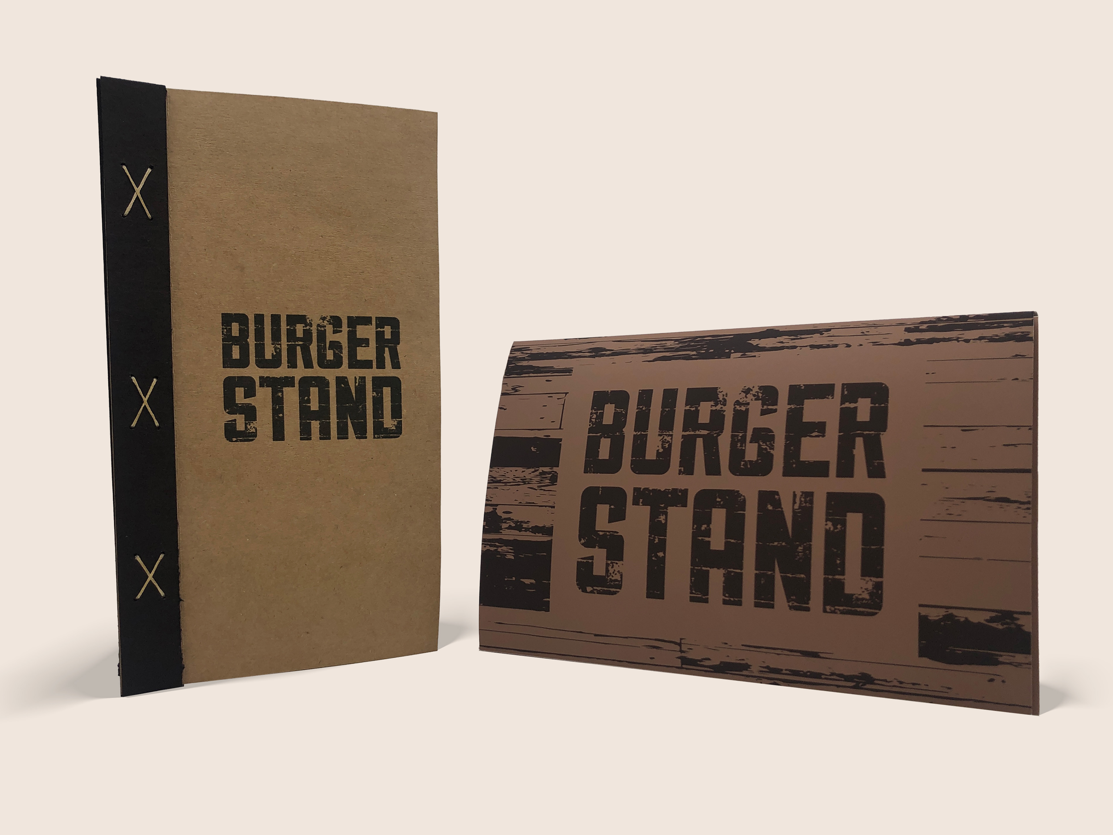
Burger stand Menu & Takeout box
About: Burger Stand Rebrand
For this project, the task was to select a local restaurant and to create a menu. I chose to create a menu and re-brand ‘The Burger Stand’ (a local restaurant located at Lawrence & Topeka Kansas). Here I will show my process and additional applications such as the website.
DESIGN process
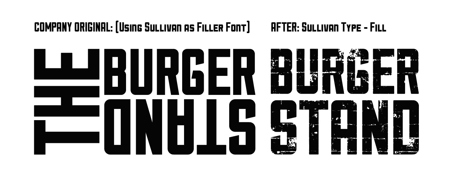
Before & After Design Process
I started to play with multiple typefaces that were sturdy before I started to play with textures, and came across Sullivan. What I changed from the original Burger Stand is by removing “the” and rotated the “stand” back to normal for readability purposes.
Original Design: Textures & Graphics
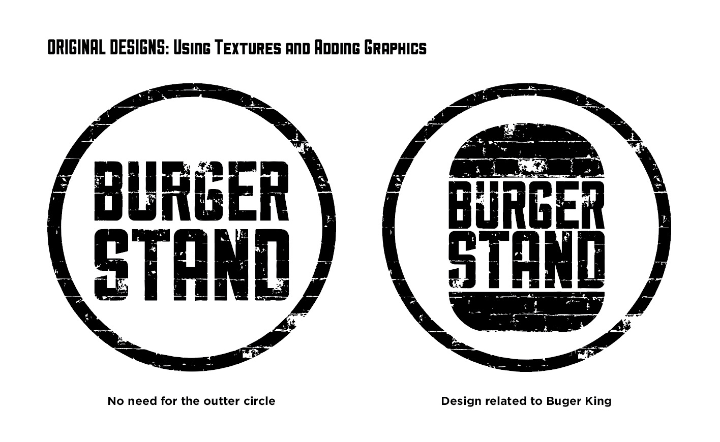
Texture & Graphic Exploration
Started to feel like the design needed less. Better minimal than adding unnecessary shapes, so I went back to the original design.
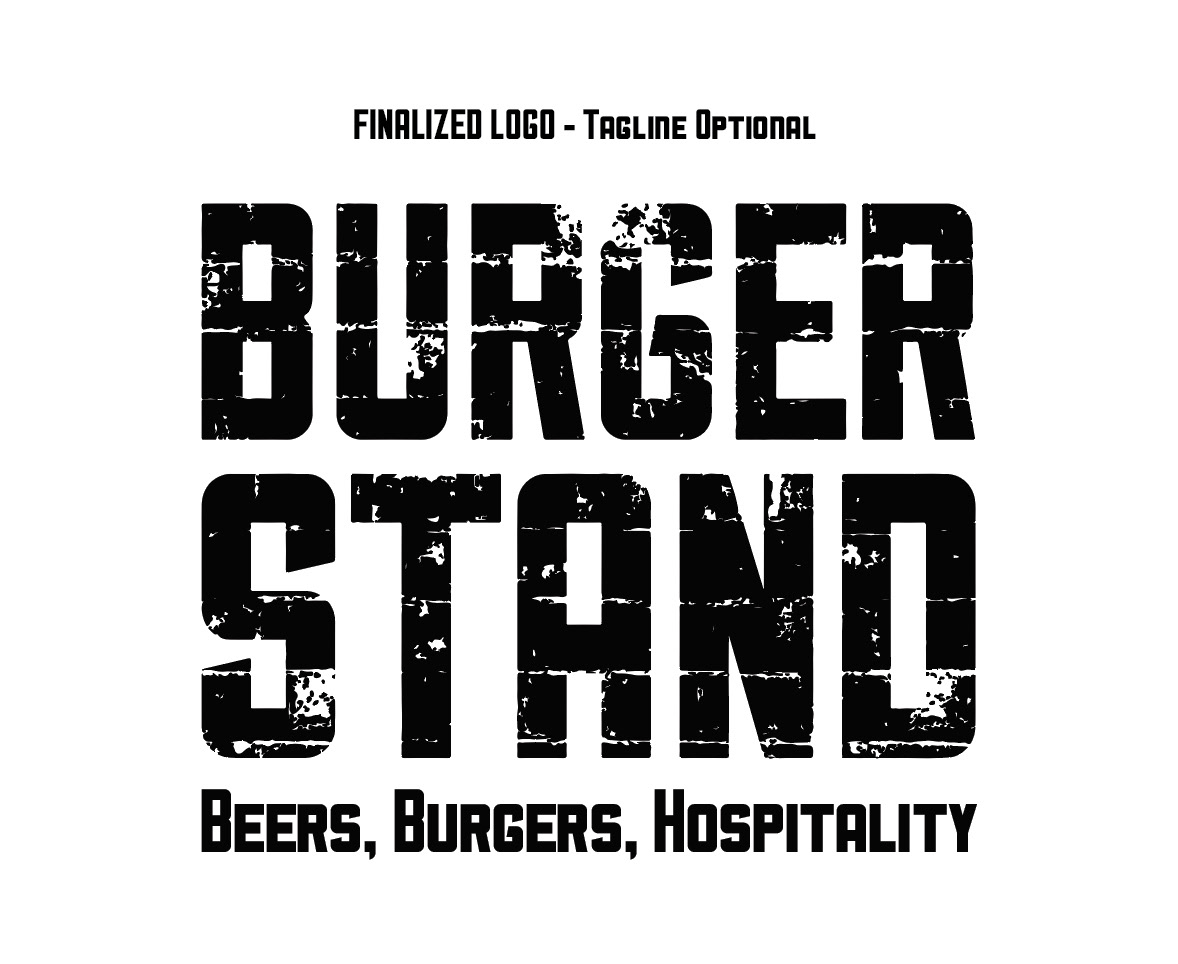
Finalized Logo (Tagline Optional)
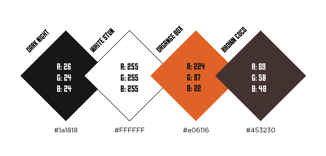
Color Palette / RGB & Hex Code
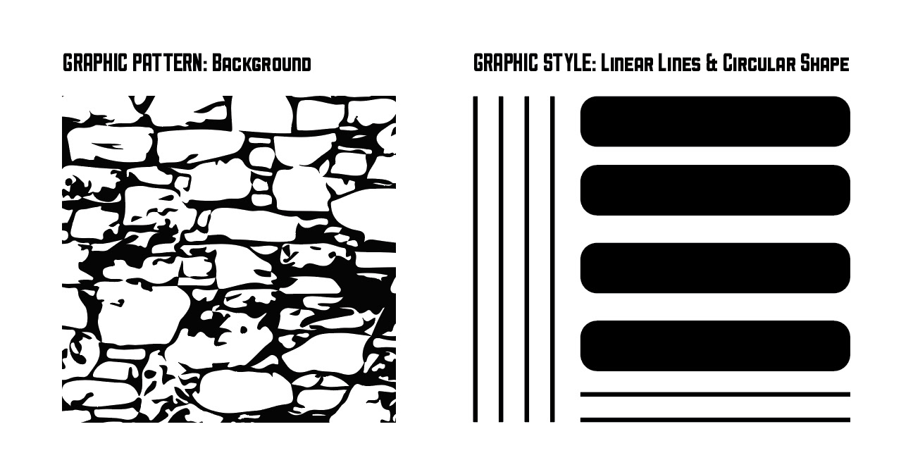
Graphic Style
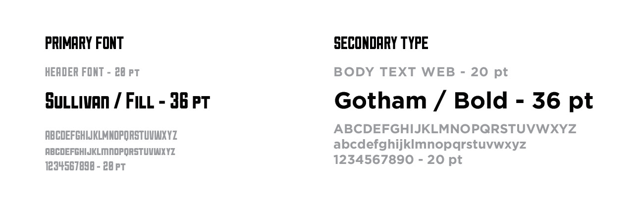
Typography Web & Menu
Images Shown are the final choices for color, type, and texture.
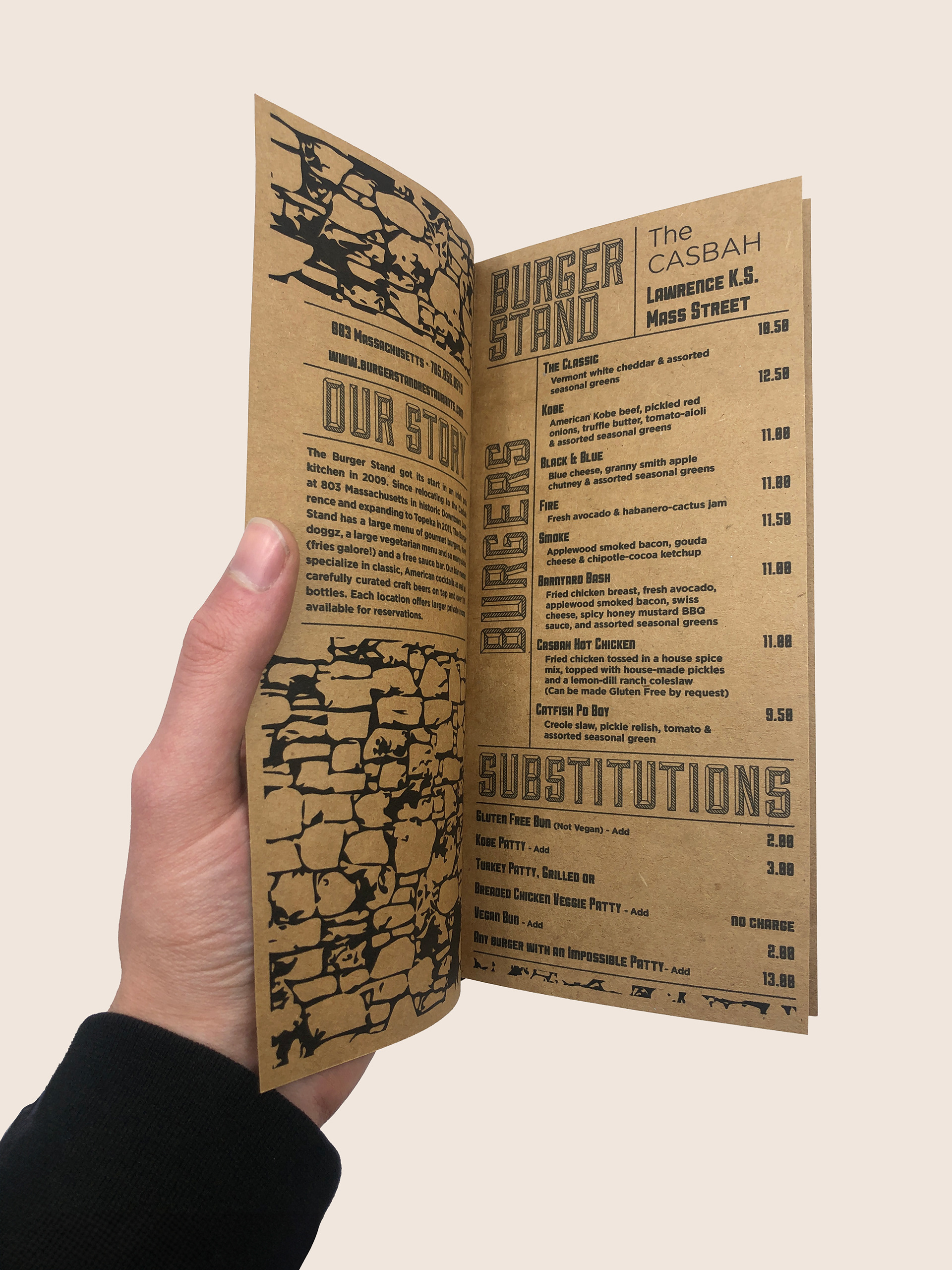
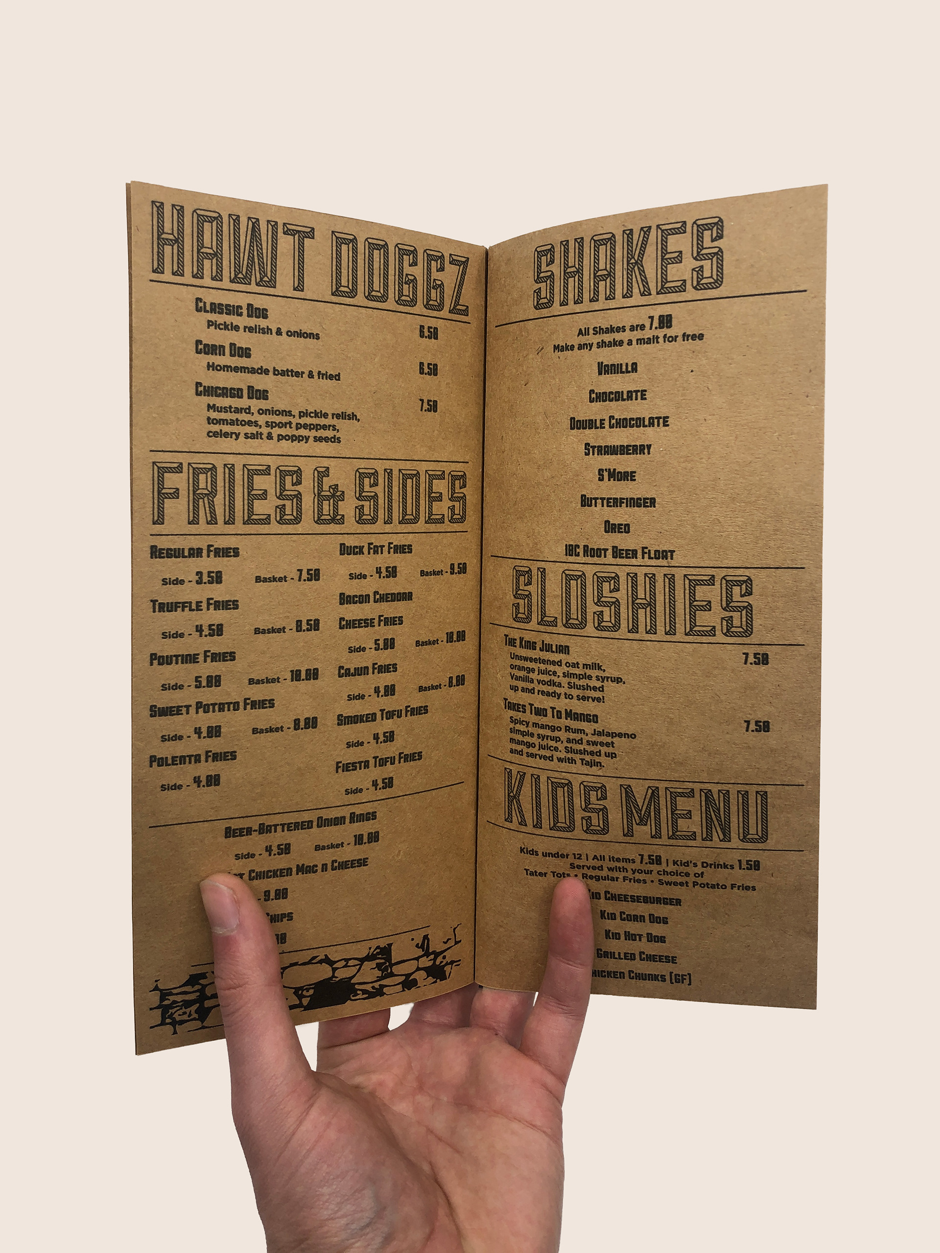
Burger stand menu
Page 1 / Front
Page 2 / Back
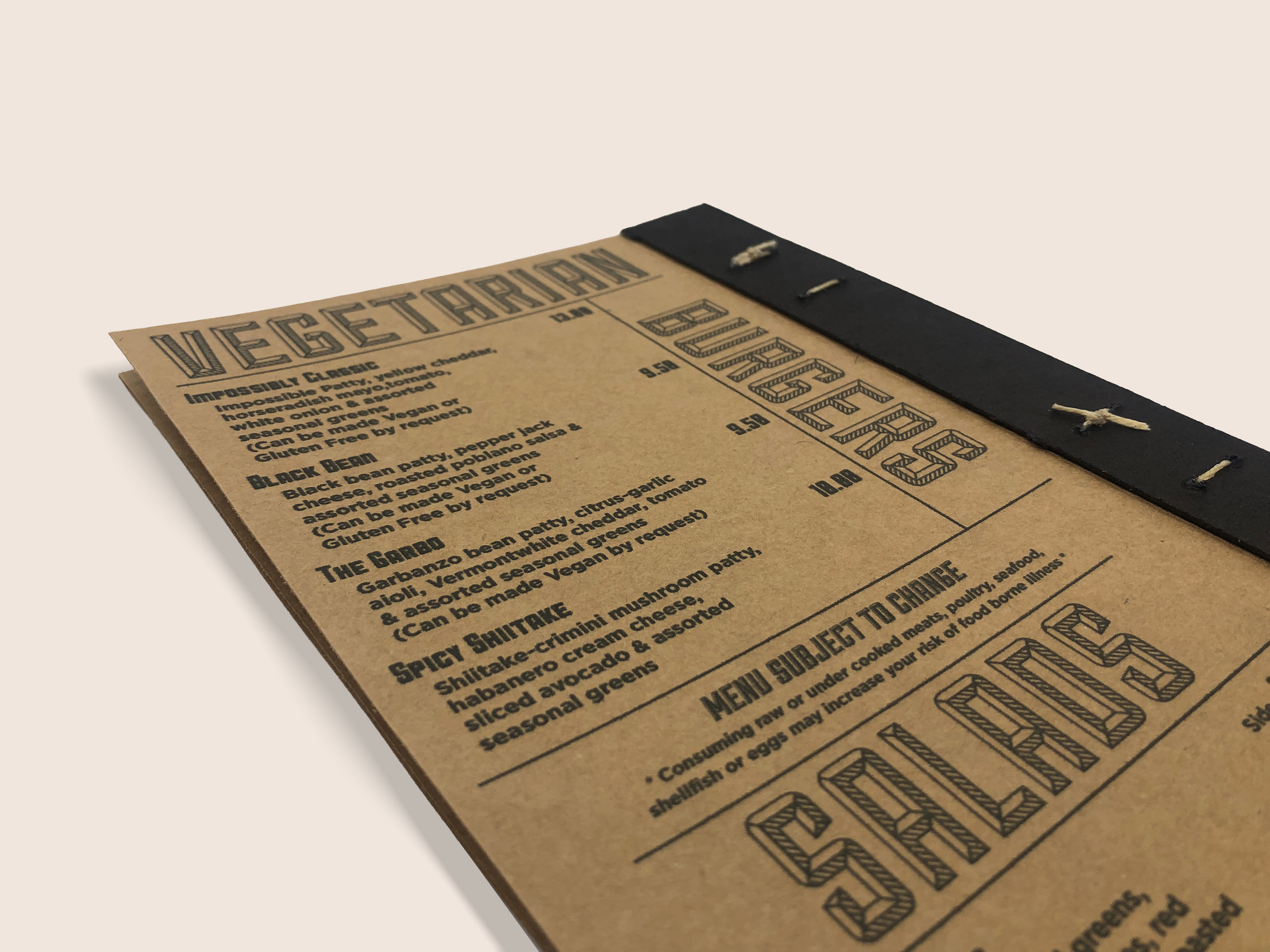
Close Up Menu
Photographs taken show the different spreads of the menu.
Burger Stand: Website
For Burger Stand, I created a new updated web that demonstrates a navigation system with brand new content. The design remains minimal but effective to allow the consumer to browse.
NOTE: The web is a beta which means not everything is interactive. The web created is to show content and navigation.
TakeOut box dieline
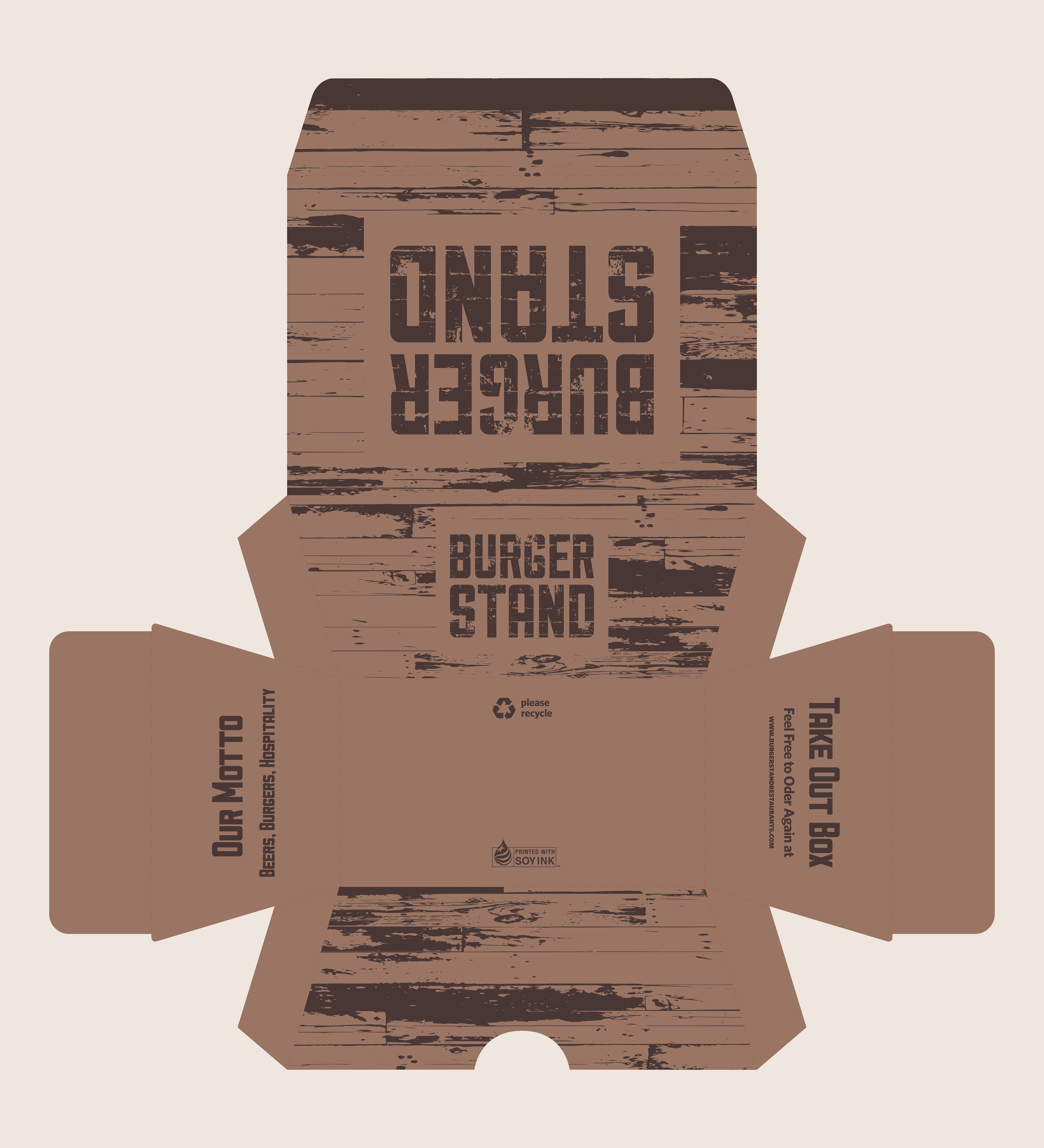
dieline created in Illustrator.
Mock-up Takeout Box
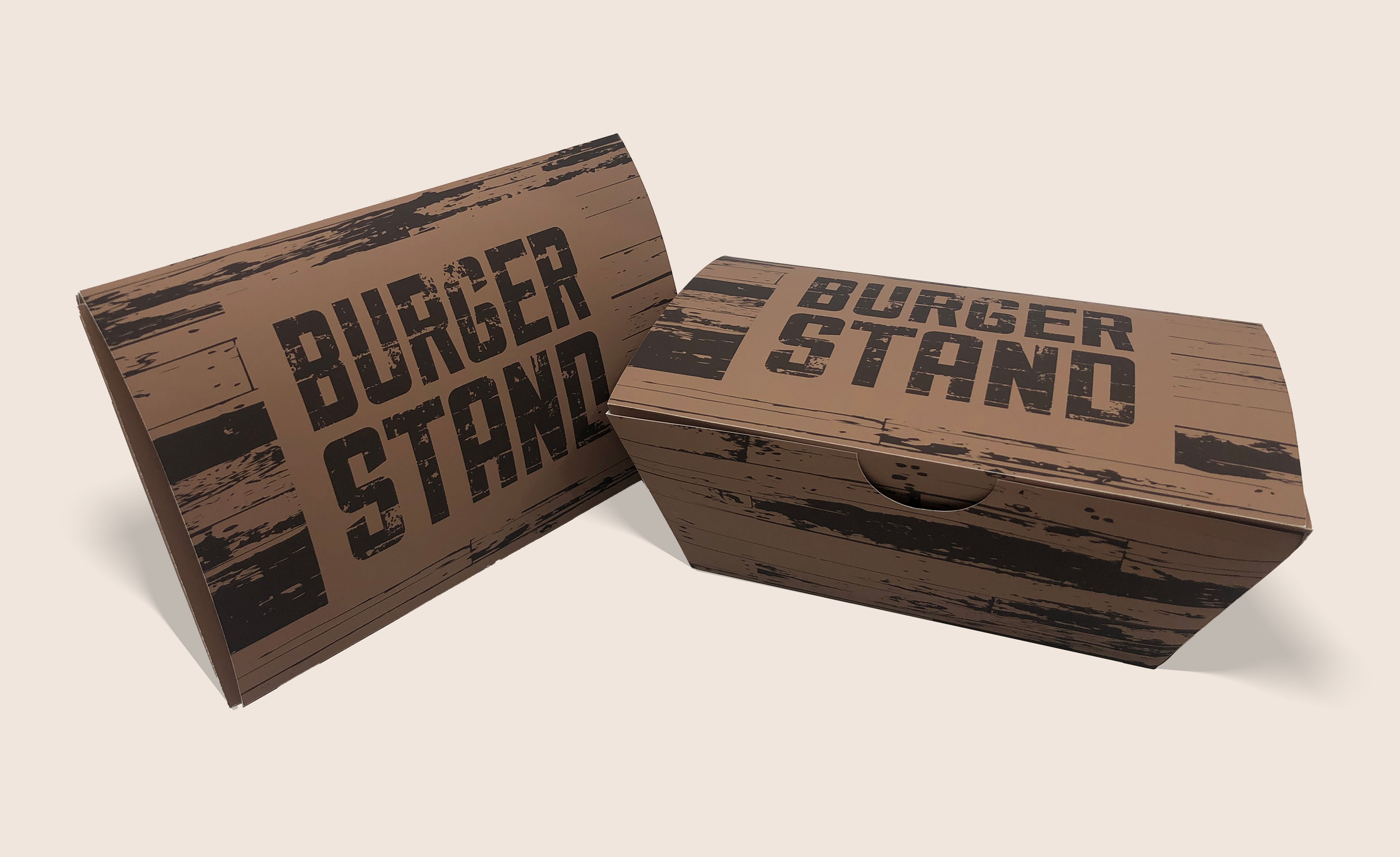
Burger Stand Mockups
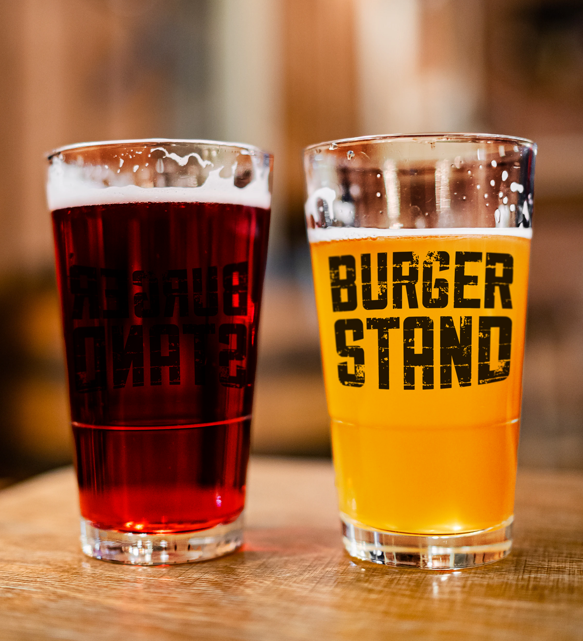
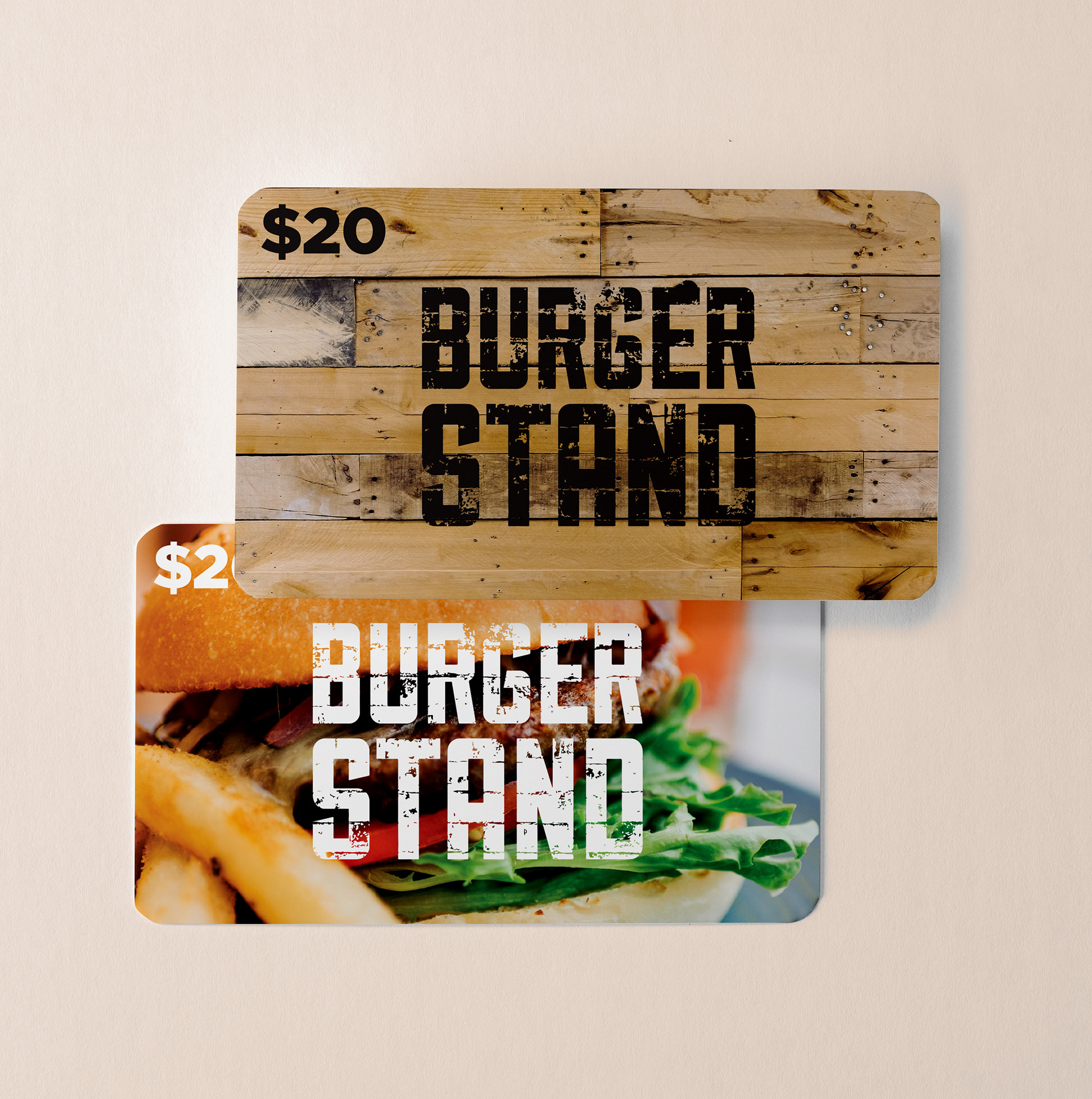
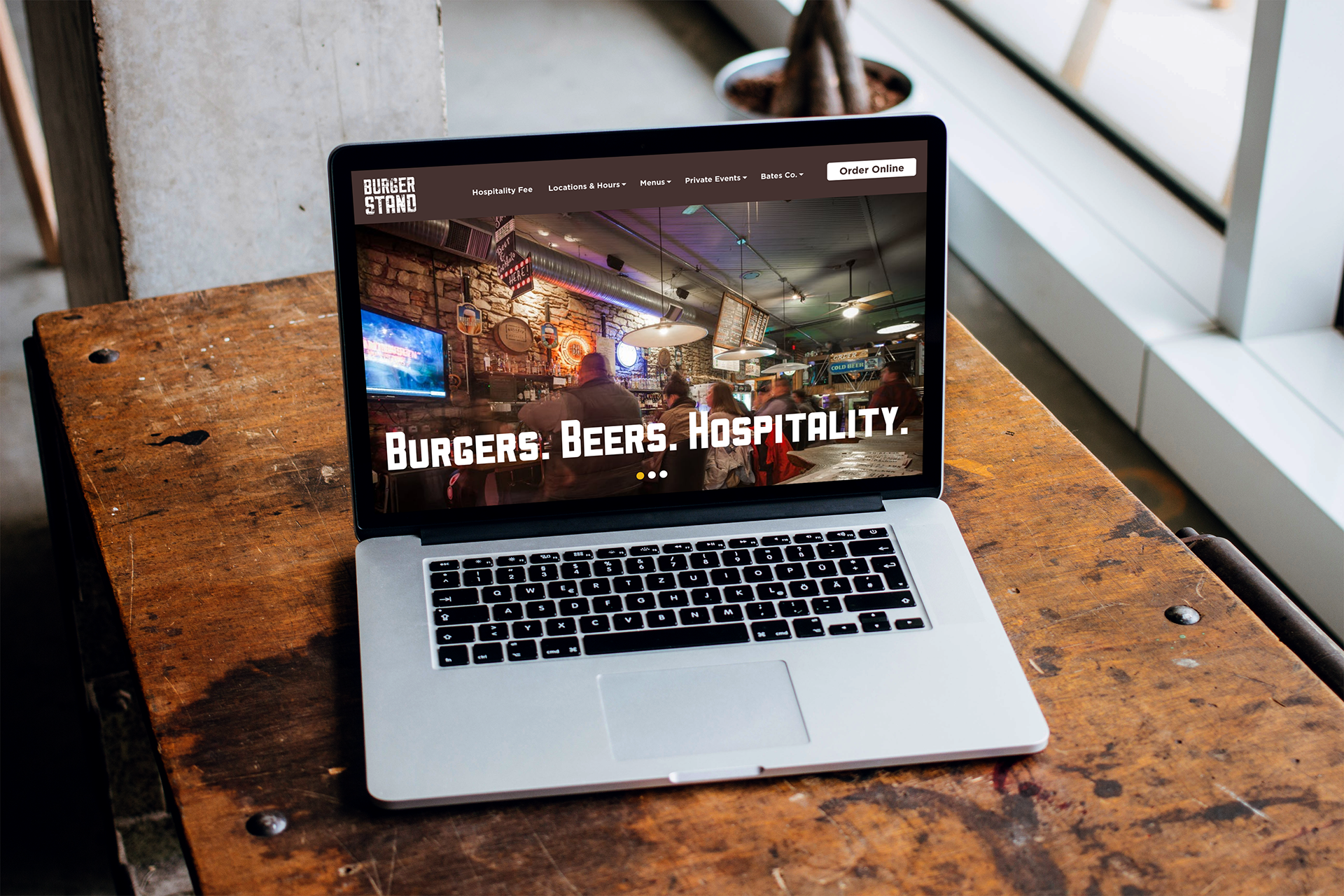
Additional mock-up of the website on the computer, Gift cards, and with vinyl embedded on the glasses.